Services
Visual Identity, print and digital. 2017
The Story
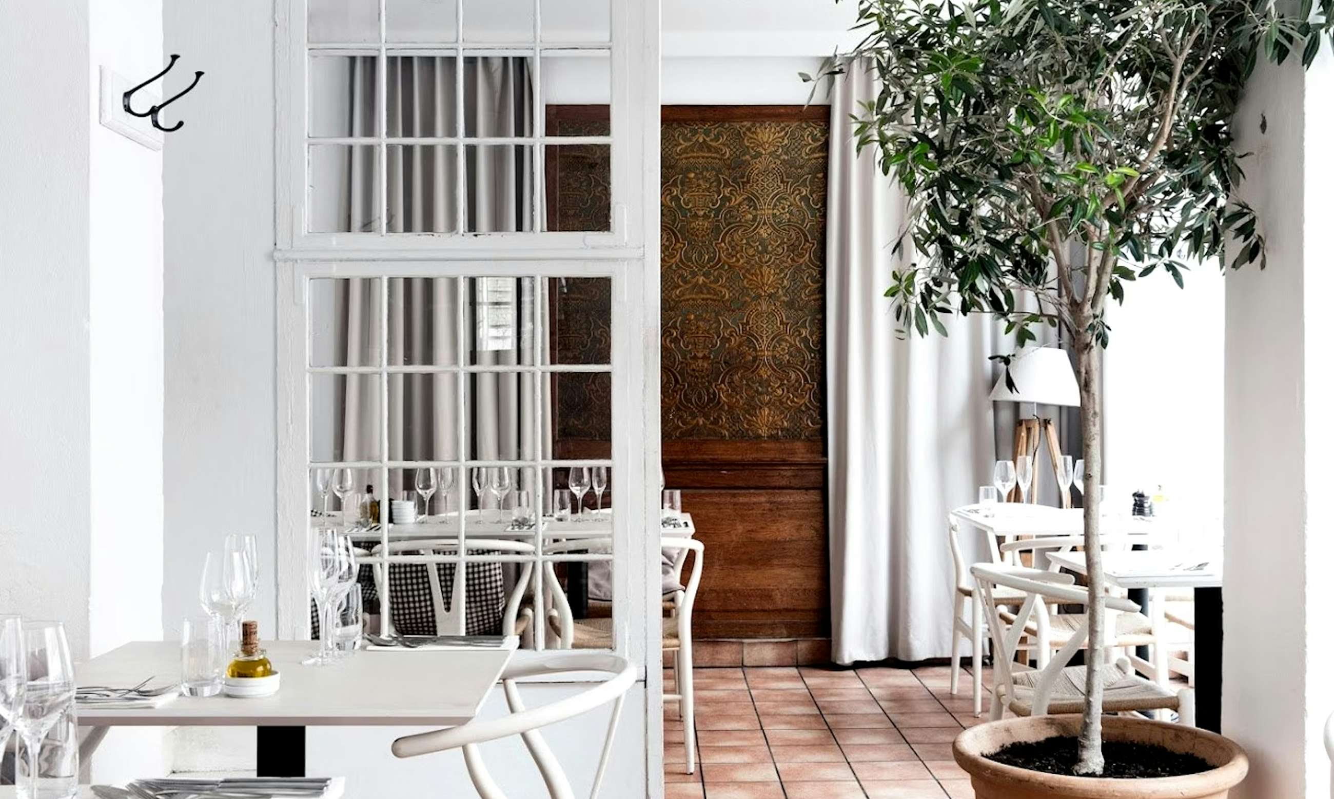
Scarpetta - drawing its name from the Italian term for that final piece of bread used to soak up sauce - embodies a warm, communal spirit of enjoying every last flavour. At its two Copenhagen locations (Rantzausgade 7 in Nørrebro and Islands Brygge 81F), the restaurant brings together modern Italian cuisine and approachable style through the umbrella of Copenhagen Food Collective (COFOCO).


Designing the Identity
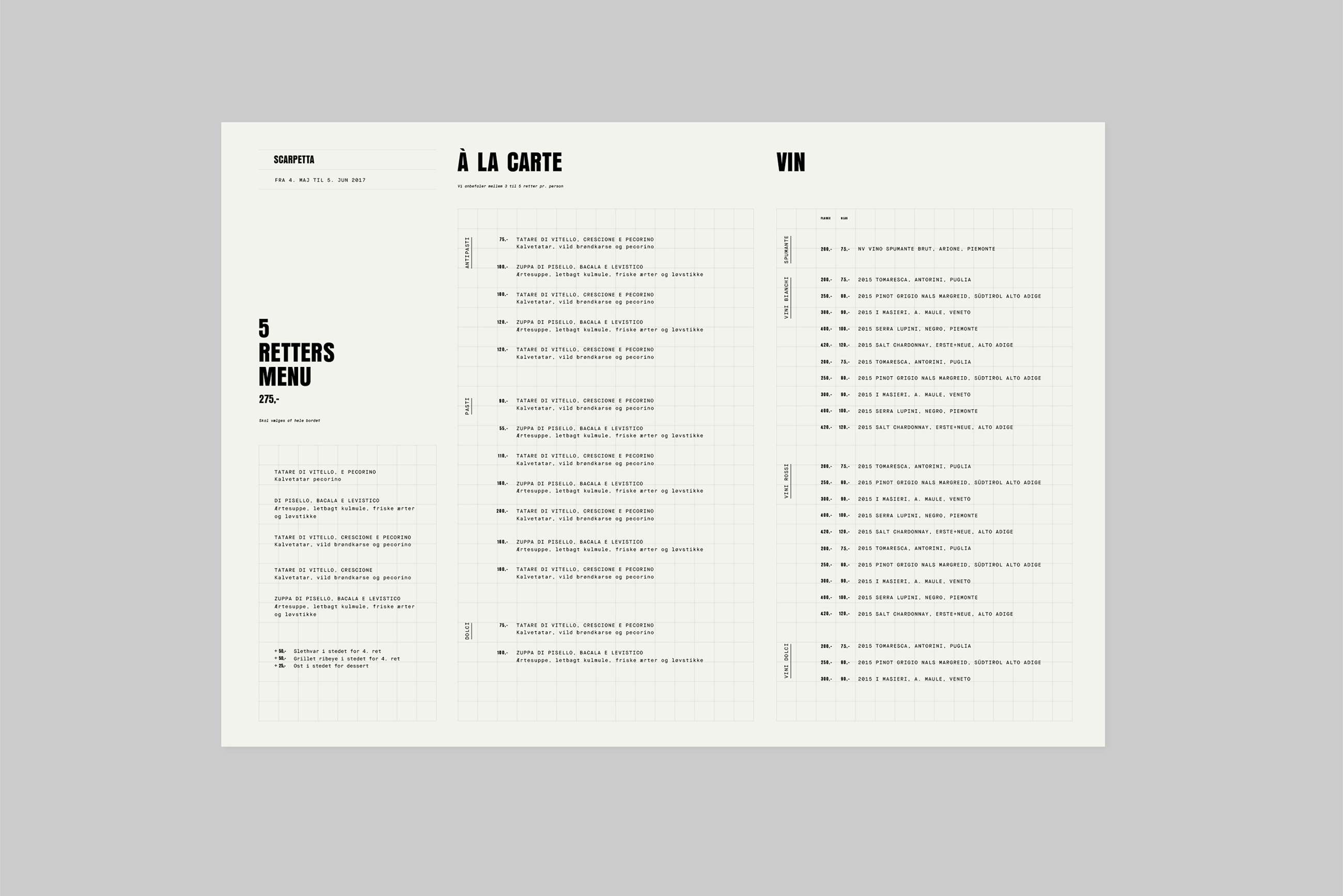
The visual identity for Scarpetta was designed to reflect this balance between tradition and modernity - rooted in authentic Italian sensibility, yet expressed through a distinctly Scandinavian restraint. The logotype carries a warmth that feels handcrafted but confident. The colour palette is understated and refined, evoking the tones of Italian ceramics and natural materials. Typography and layout choices communicate a quiet confidence - contemporary, but never detached.


Identity spaghetti
Every element was created to support the same feeling of ease and generosity that defines the dining experience. Whether on menus, signage or digital channels, the design system creates a familiar rhythm that links the two restaurants, while allowing each to express its own local atmosphere. Rantzausgade feels intimate and energetic; Islands Brygge more open and light. Together, they tell the story of one brand, two expressions.
Services
Visual Identity, print and digital. 2017
The outcome
With a coherent identity that bridges both locations, Scarpetta stands as a unified brand within the Cofoco family — modern Italian dining with warmth, depth and personality. The design reinforces Scarpetta’s ability to feel both approachable and sophisticated, helping it maintain its place as one of Copenhagen’s most beloved casual dining destinations.
Explore more of our work

