
Services
Visual identity, Print material, Menus, Signage & Responsive Website. Year 2017
Information
Le Trois Cochons is one of Cofoco's first restaurants and we help them revitalize the branding and and online presence.
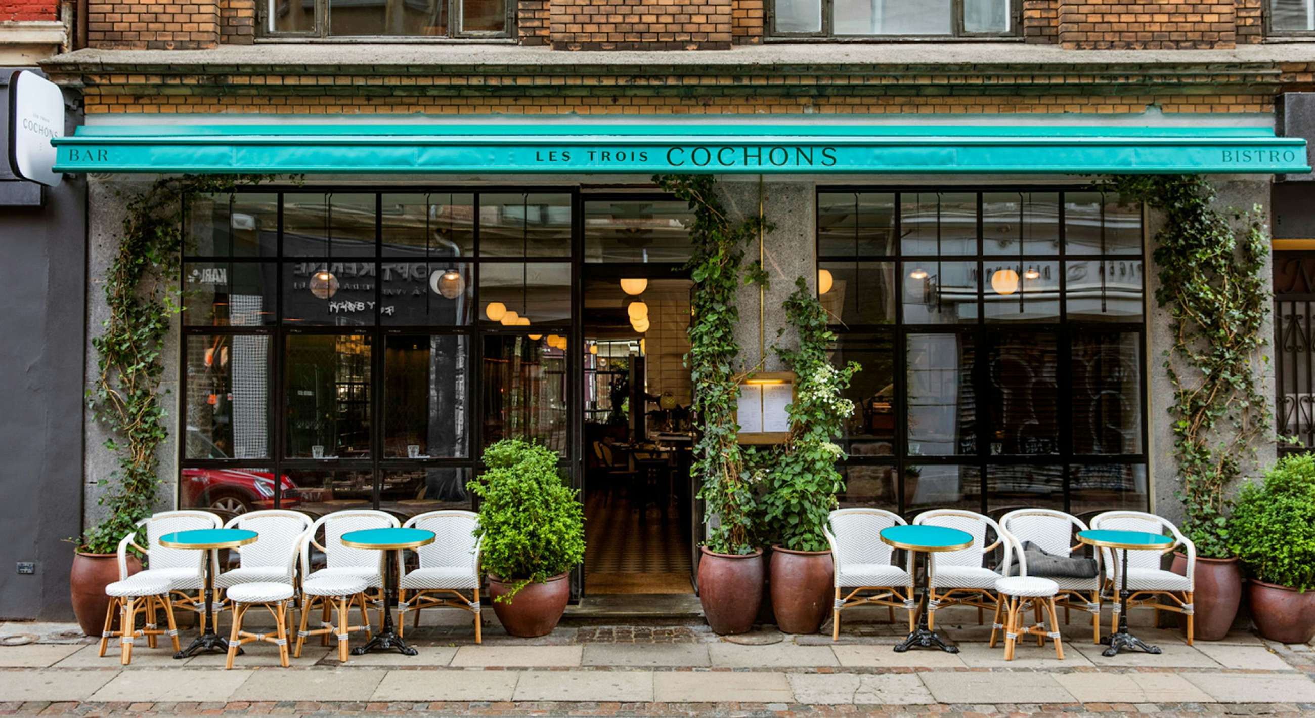
They serve French bistro style food and are inspired by Parisian corner cafés with a touch of the Riviera.
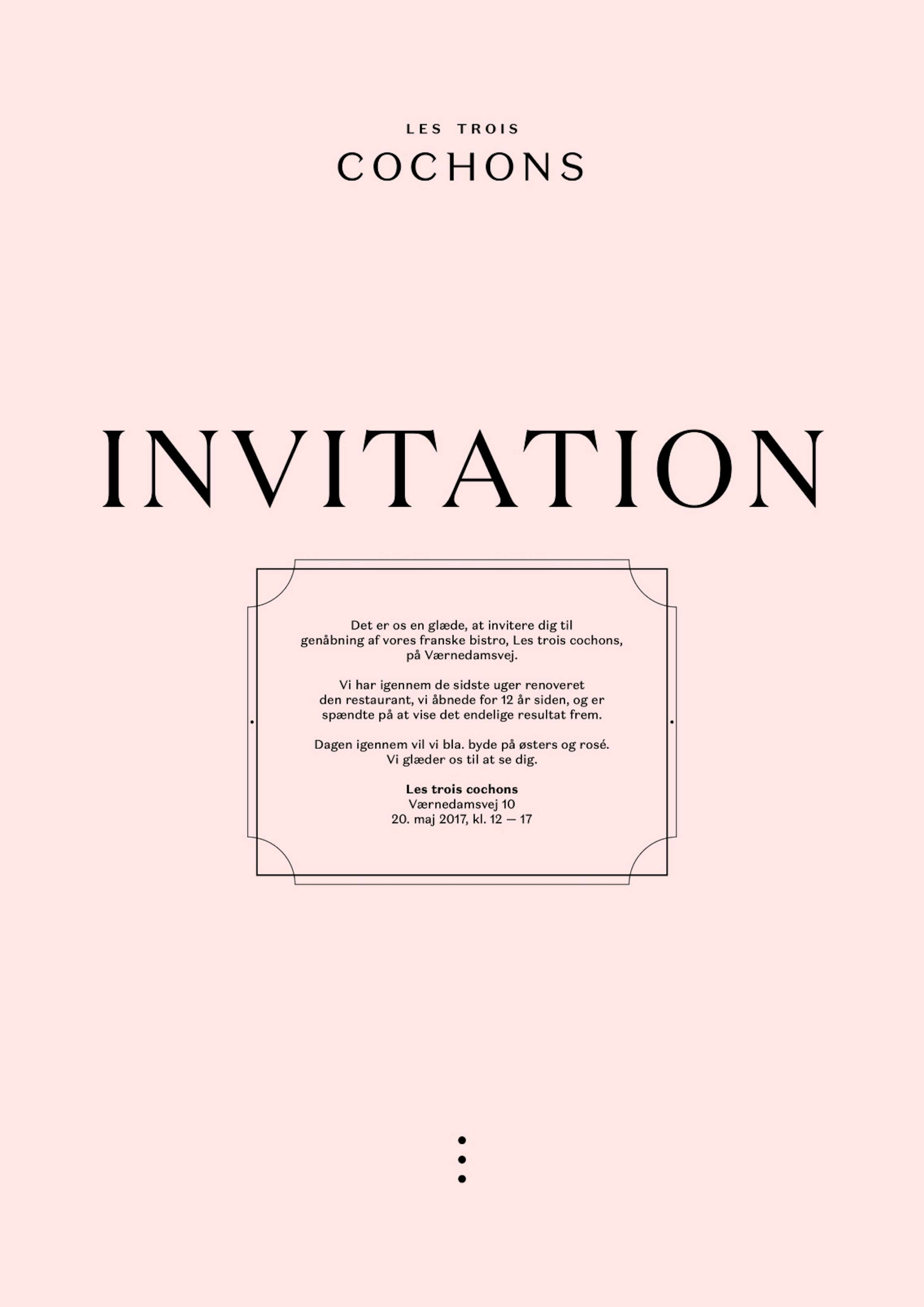
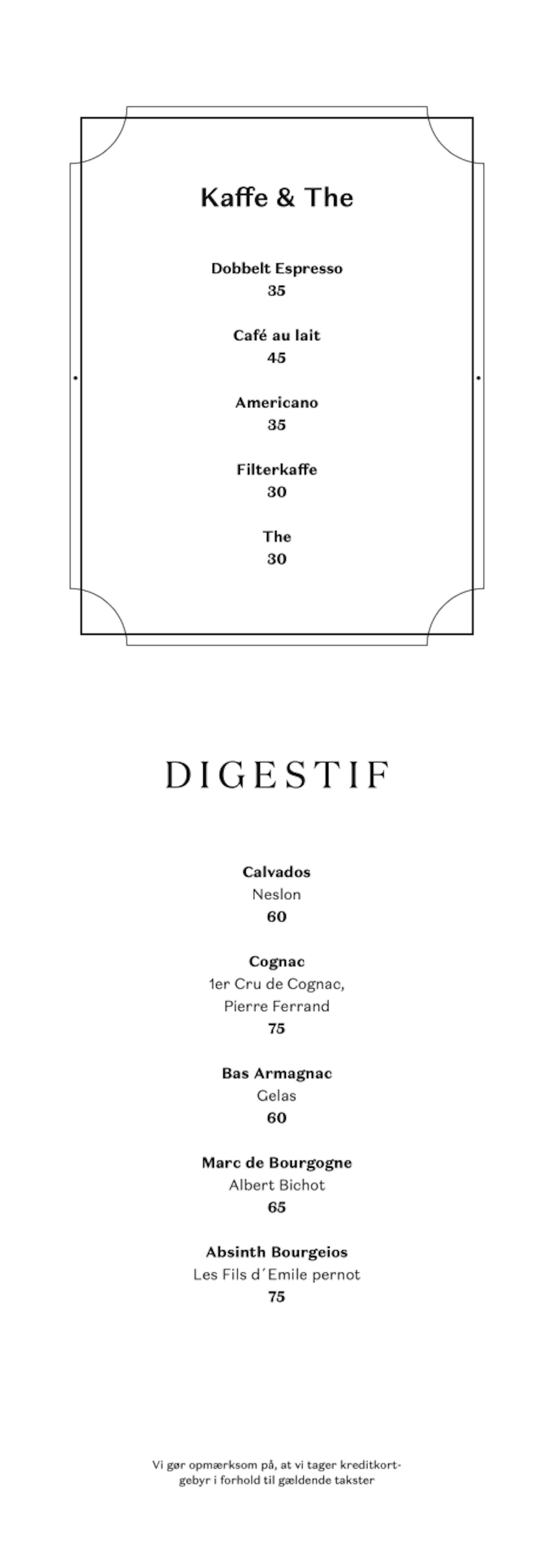
The branding springs from the heritage while fusing modernism and tradition into a bespoke wordmark, an element of three dots referencing the three little pigs, a full colour palette partnered with a flexible type family which is full of character.

The Three Pigs
Which is what Les Trois Cochons means, are visualized as three dots placed vertically acting as an extra branding element which can stand alone or in composition with the wordmark.
The wordmark itself is written in bespoke type with nods to Art Nouveau and the tails of the little pigs have made their way in as pointy serifs.

Colors & Typography
The palette is feminine with light pinks and deep greens lightened with golden/brassy metals.
We chose the Domaine font family which provides a wide variety of typefaces with a nice character.


Online experience
The website is build on the platform we made for Cofoco. It is controlled in layout but flexible in branding and content so you are in no doubt where you are at any point. From here you can be inspired to dine in one of Cofoco's other 13 restaurants.

Getting out there
The feeling of getting your hard work back from the printer is priceless, and seeing the work we have done for LTC in real life around the beautiful restaurant is just such a nice feeling. It all comes together there. If you are ever in Copenhagen, you should head by the restaurant, enjoy an oyster and some bubbles, and suddenly you are in the best part of France.


Services
Visual identity, Print material, Menus, Signage & Responsive Website. Year 2017
Information
Le Trois Cochons is one of Cofoco's first restaurants and we help them revitalize the branding and and online presence.

