Services
An online concept store. Strategy, Concept Development, UX Design, Visual Design & Art Direction. Year 2017
Thirteen Chocolate Bars, No Rules
“We are looking for a different type of e-commerce experience that captures the personality of the brand and the bars themselves.”
This was basically the brief.
We wanted to give the user a memorable experience and maybe even a smile on their face after the visit. The site should still have a functioning shop, selling Simply Chocolate's 13 'hero' products. We’d be breaking new ground and playing with users’ expectations in e-commerce territory where the philosophy of ‘tried-and-tested’ normally rules.
🏆 Won e-commerce site of the year at Awwwards 2017

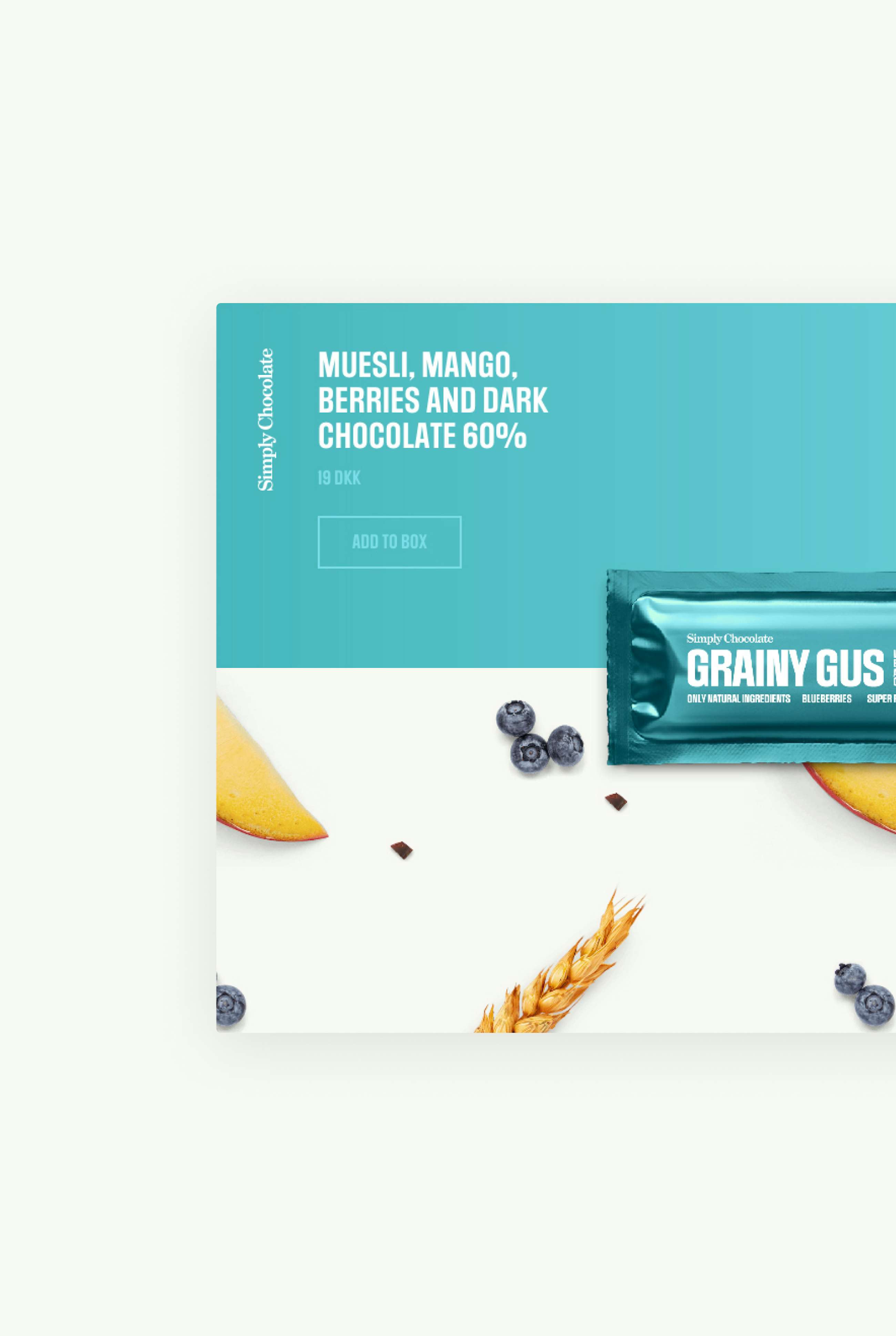
Meet the Bars
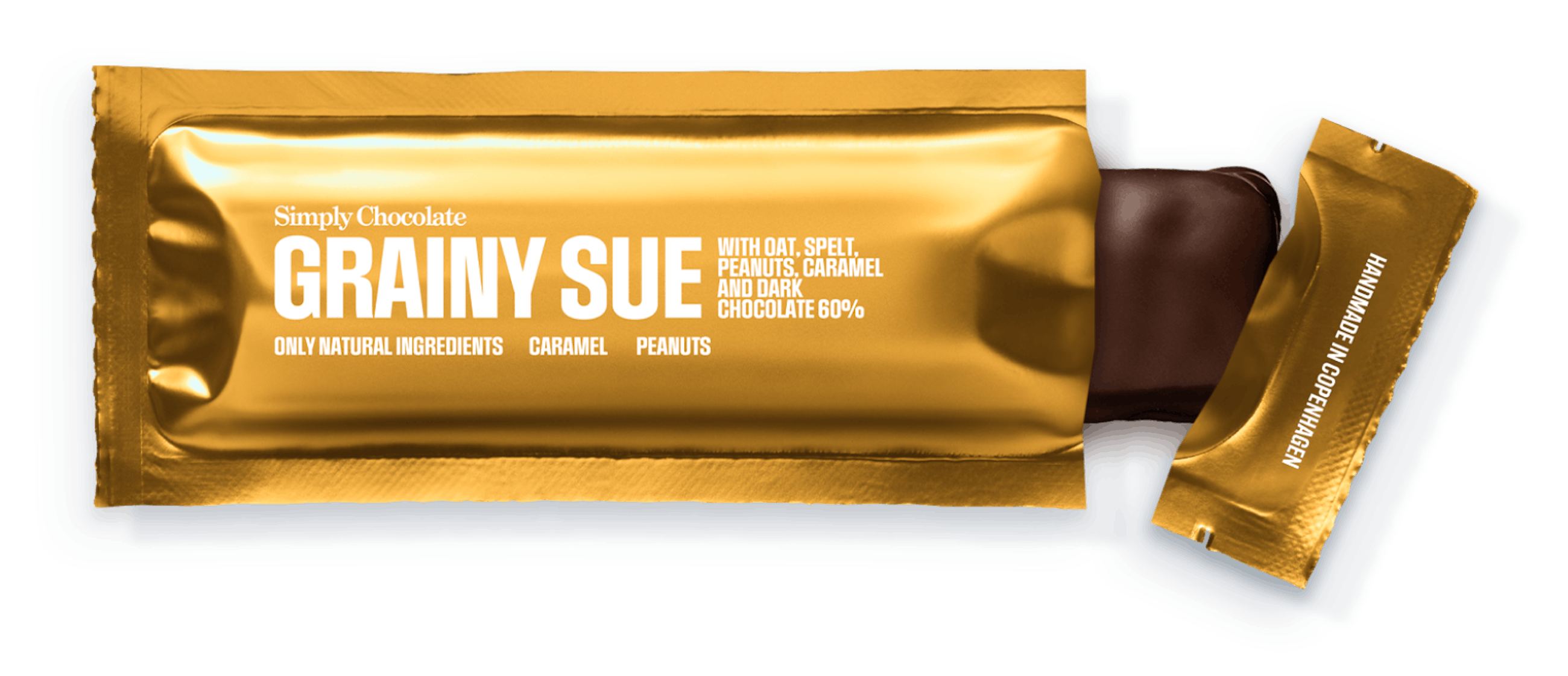
We took the chocolate bars and placed them center stage. You can unwrap each bar, take a bite of it, even (almost) have a conversation with it. You can add them to your shopping box at any time and adjust the amount directly in the buy button. The minimum order is 20 bars which may seem like a lot, but trust us - they tend to disappear fast!

Computerised bars
The wrapping on the bars is made from layers of coded goodies. At the base we have a greyscale photo which is cropped by an SVG mask. Through the CMS you can add a color range to to give a very life-like coloured look. You then upload the graphics which is applied on top to form the complete bar and a shadow is then applied at the end.
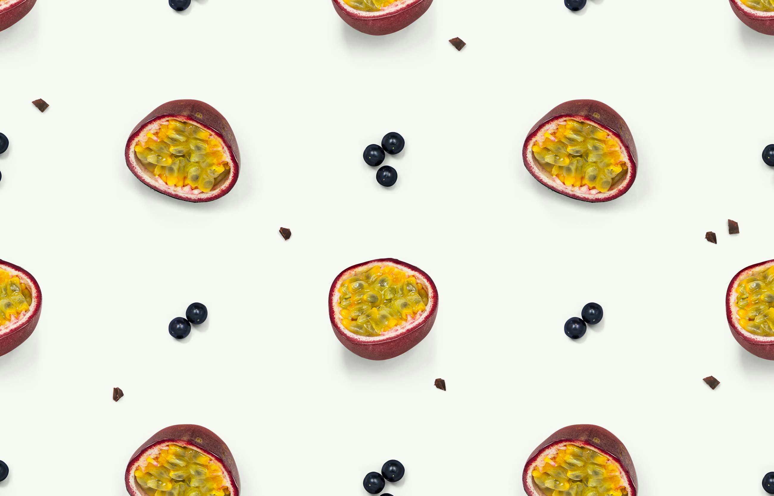
Tasty Patterns
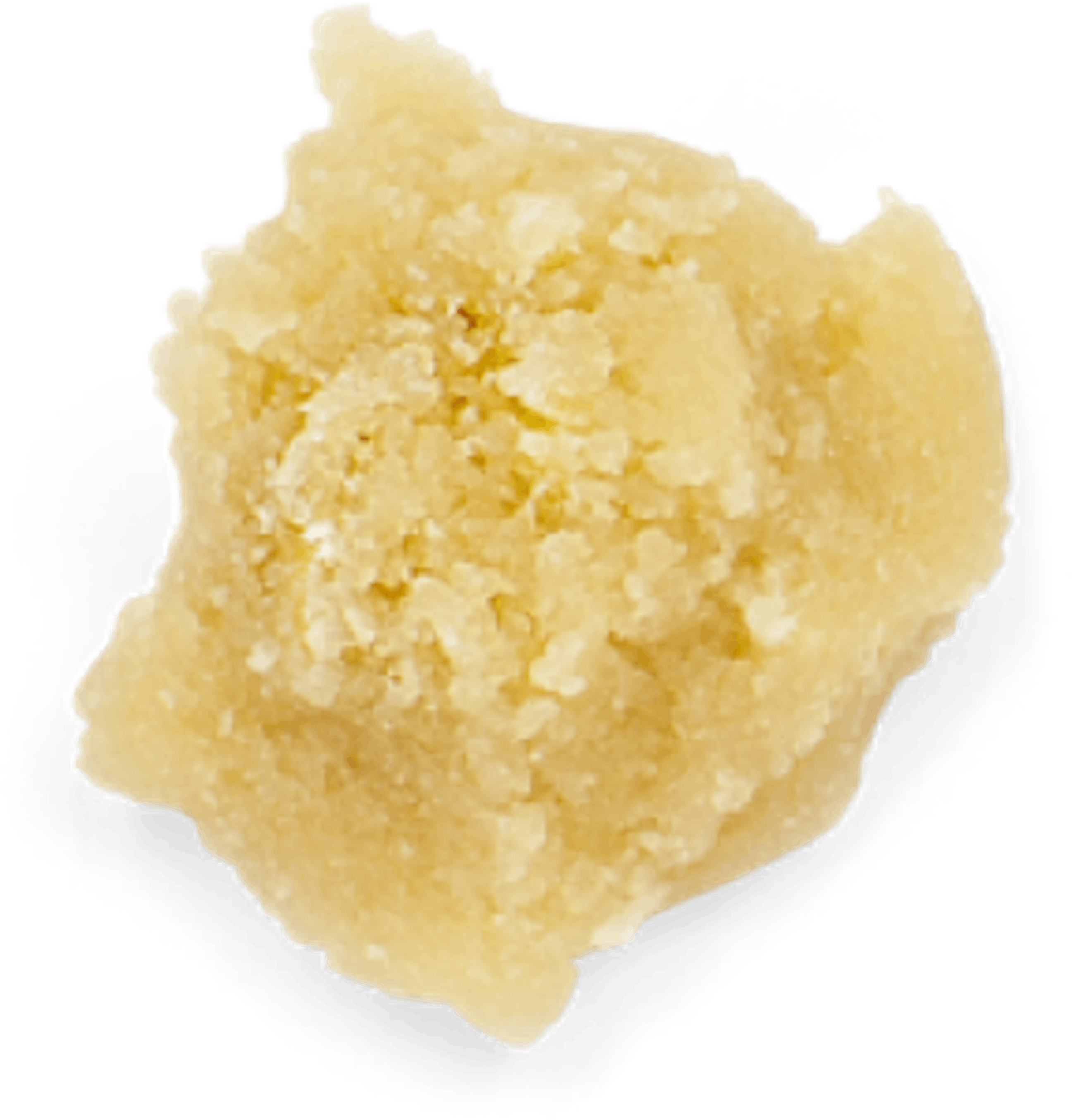
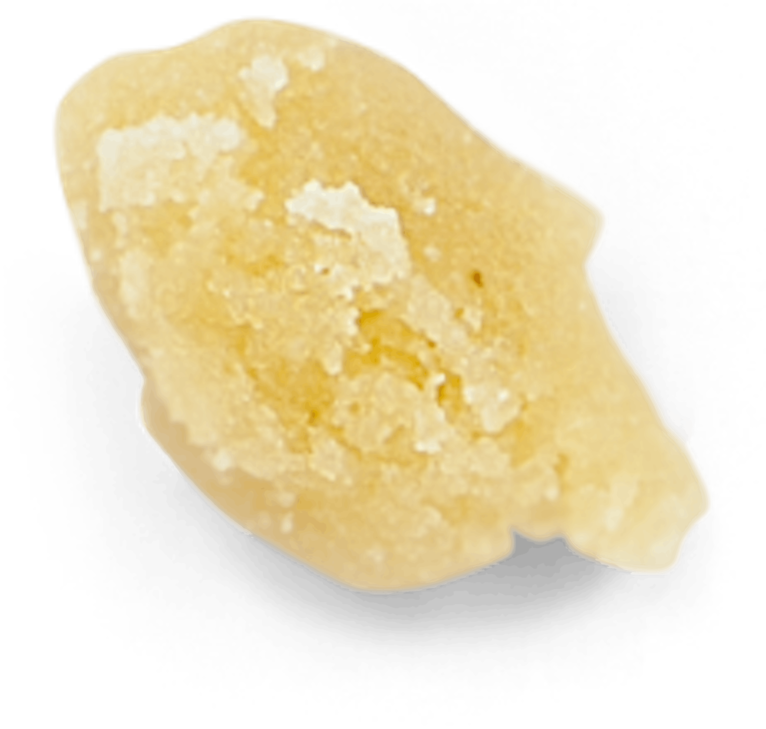
Each bar has a personality and that is made from the ingredients that went into it. We let each bar brand the entire site with colours as well as a pattern made from images of the ingredients. The patterns are generated automatically and we can choose the ingredients directly in the backend for each bar. This makes adding future bars a breeze.

The end result
Simply Chocolate has been one of the most award winning projects we have made and it has helped defining Spring/Summer and our purpose. We are very proud of having made a site like this that has inspired others and still looks fresh to this day.


Behind the Scenes
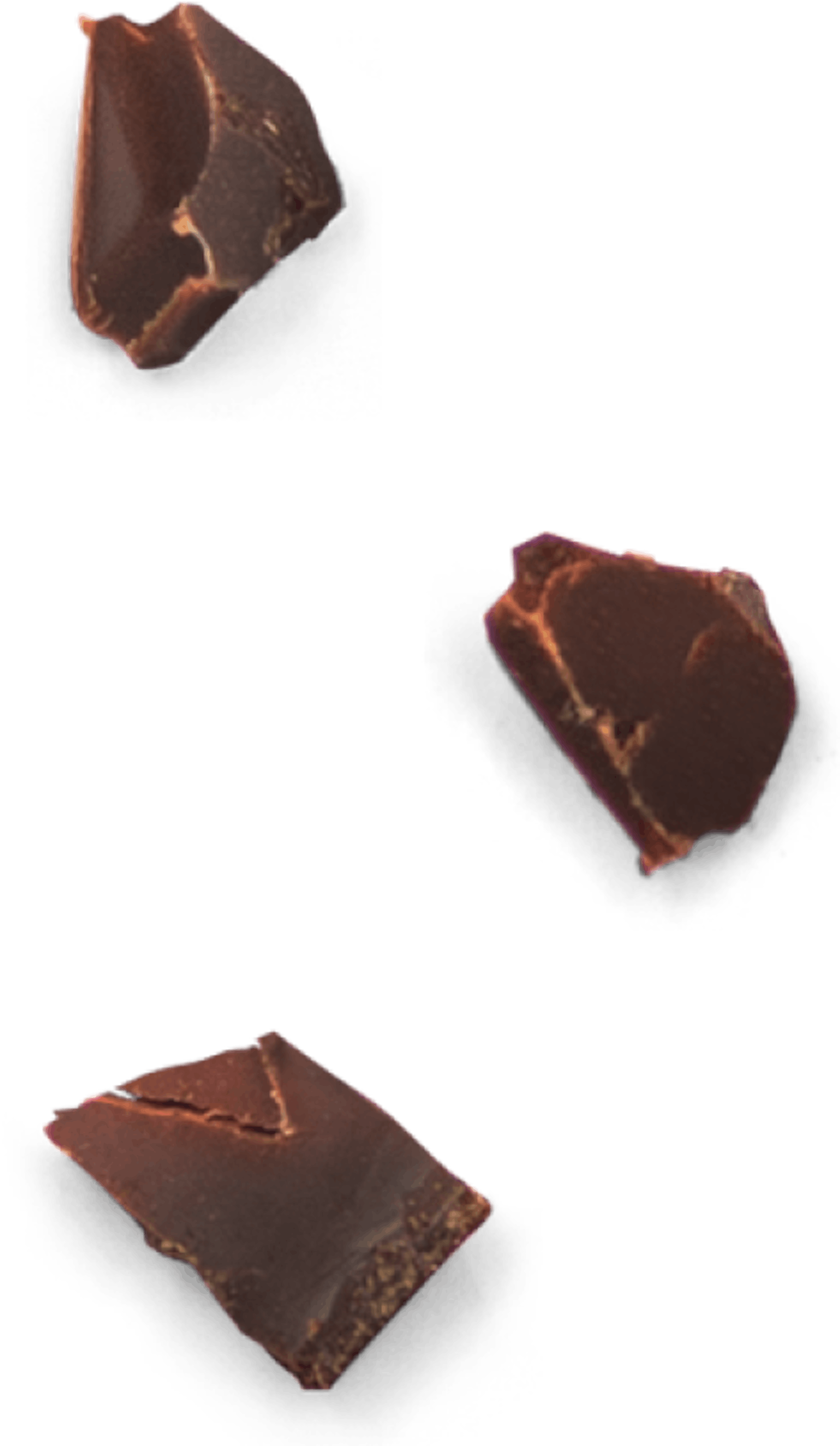
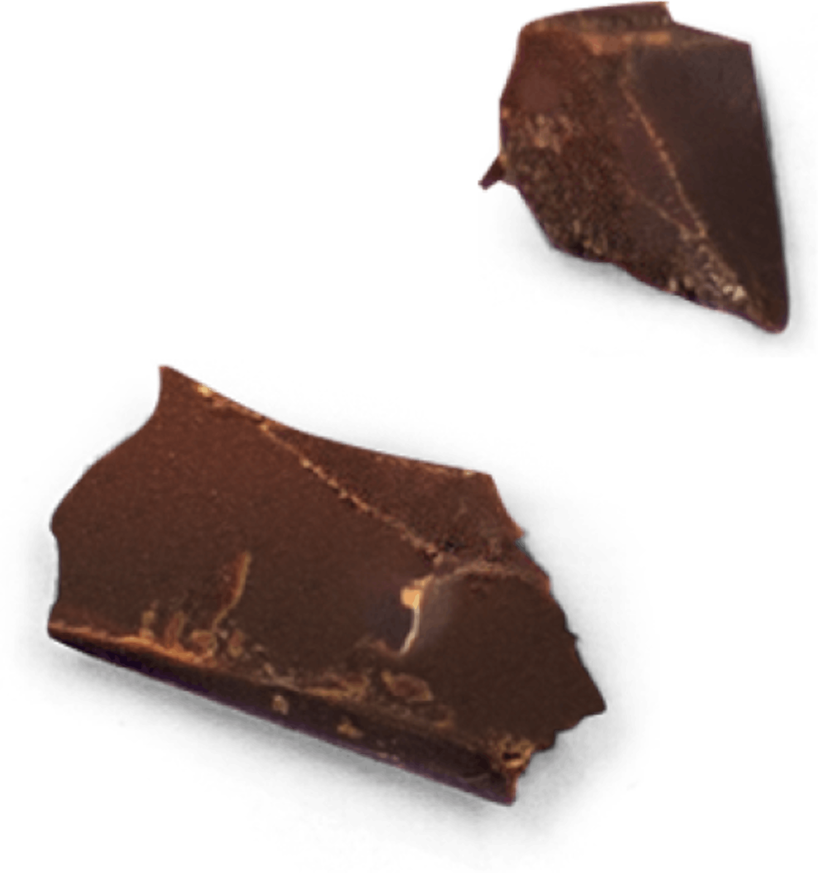
We had two major shoots for this to happen. First shoot was to capture the wrapping and the bars from the outside and broken off. We ended up using the shadows and highlights from the wrapping, and from that build a coded version of the colours as well as the print of the wrapping. The ingredients were shot in our own office in a more simple setup but we put a lot of work into the treatment of these images. The combination of how we made the wrapping and the ingredients makes it quite easy to add new bars to the site down the road.


Services
An online concept store. Strategy, Concept Development, UX Design, Visual Design & Art Direction. Year 2017
Thirteen Chocolate Bars, No Rules
“We are looking for a different type of e-commerce experience that captures the personality of the brand and the bars themselves.”
This was basically the brief.
We wanted to give the user a memorable experience and maybe even a smile on their face after the visit. The site should still have a functioning shop, selling Simply Chocolate's 13 'hero' products. We’d be breaking new ground and playing with users’ expectations in e-commerce territory where the philosophy of ‘tried-and-tested’ normally rules.
🏆 Won e-commerce site of the year at Awwwards 2017
Awwwards
Site of the year
Awwwards
Site of the day
CSS Design Awards
Food site of the year
CSS Design Awards
Site of the day
Creative Circle
3 x Gold Circle
FWA
Site of the day
Awards
