Services
Launch of product page. Design, Motion Graphics & Development. Year 2017
Information
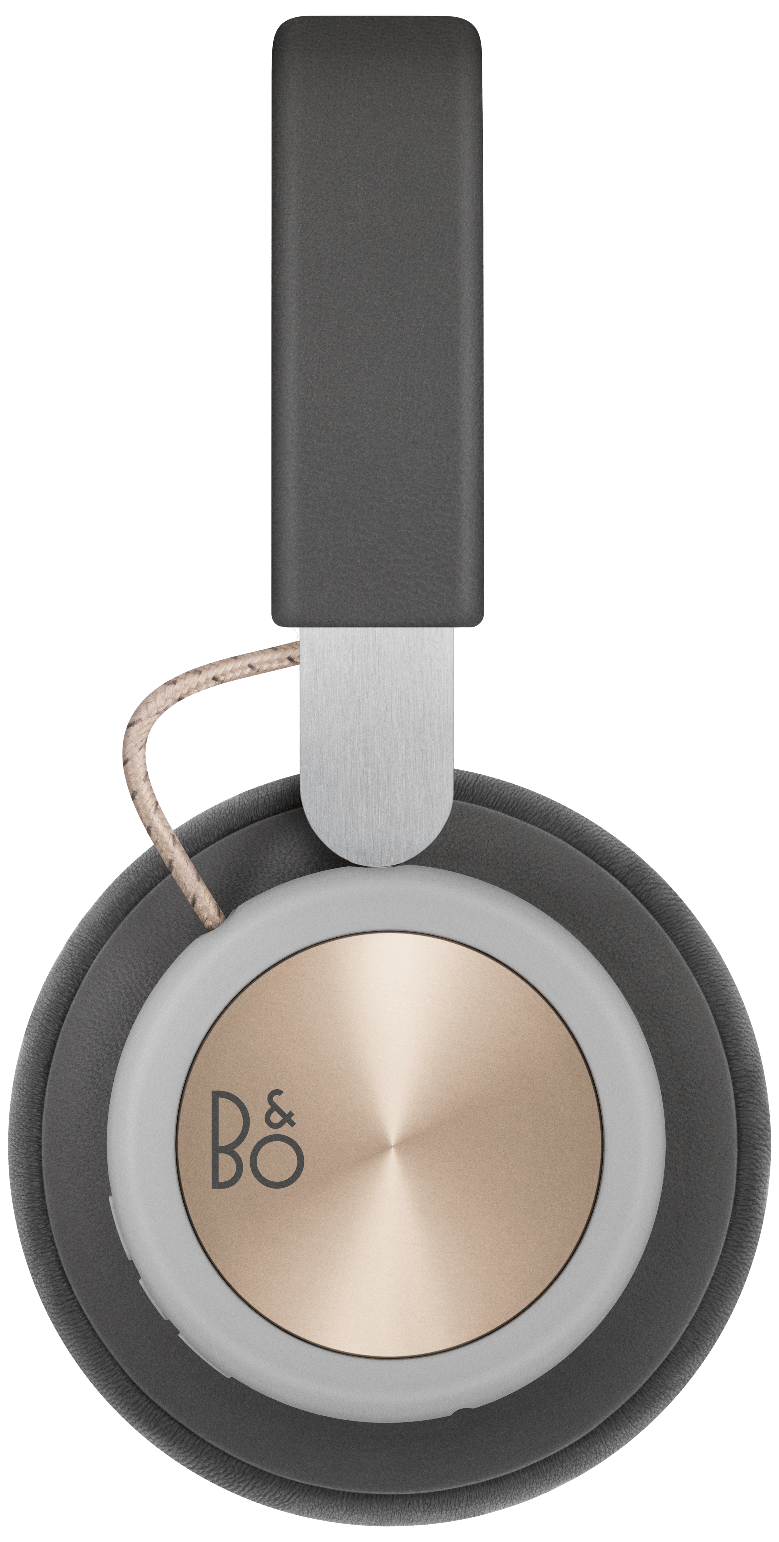
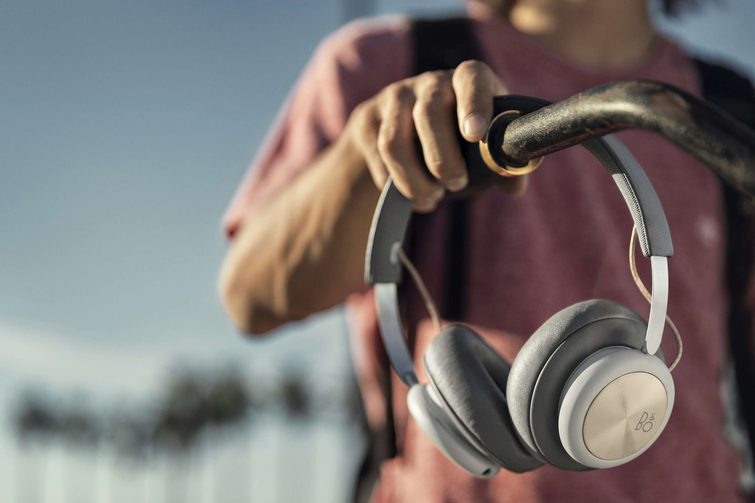
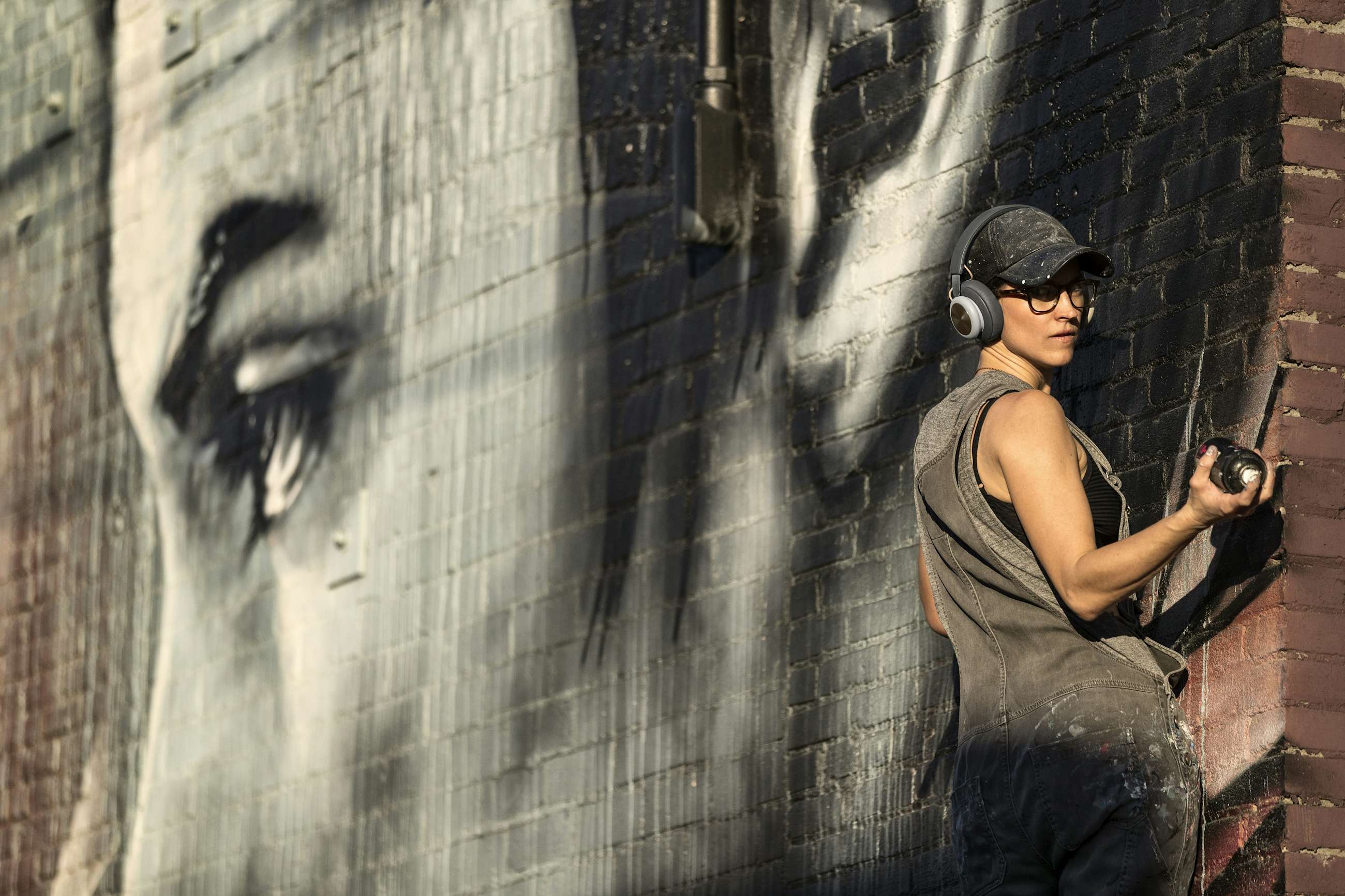
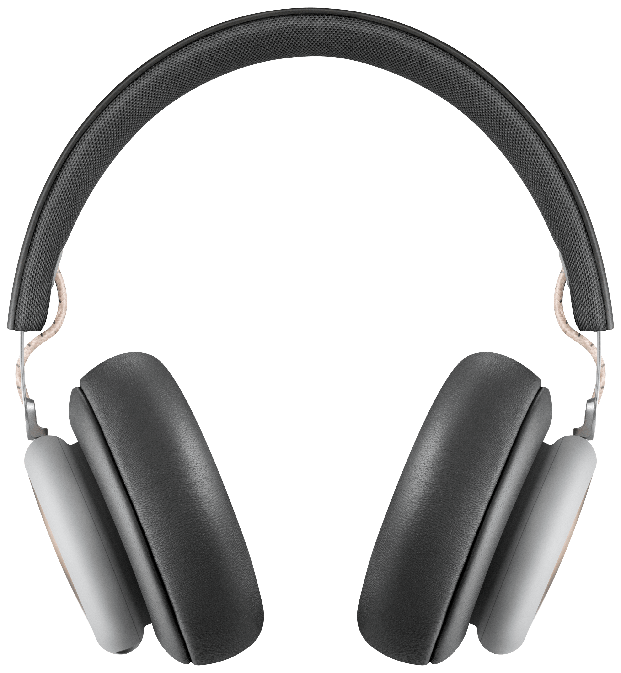
B&O Play H4 was a new kind of wireless headphone for the young urbanite who values iconic simplicity and likes to travel light. H4 offers unmatched simplicity for free movement both in style and function.
The main objective for the website was to drive brand awareness via an authentic campaign page that encourages users to take part. And create the H4 website in an impactful way that creates attention, involves users in content generation, and takes market share by appealing to a younger segment.


The concept
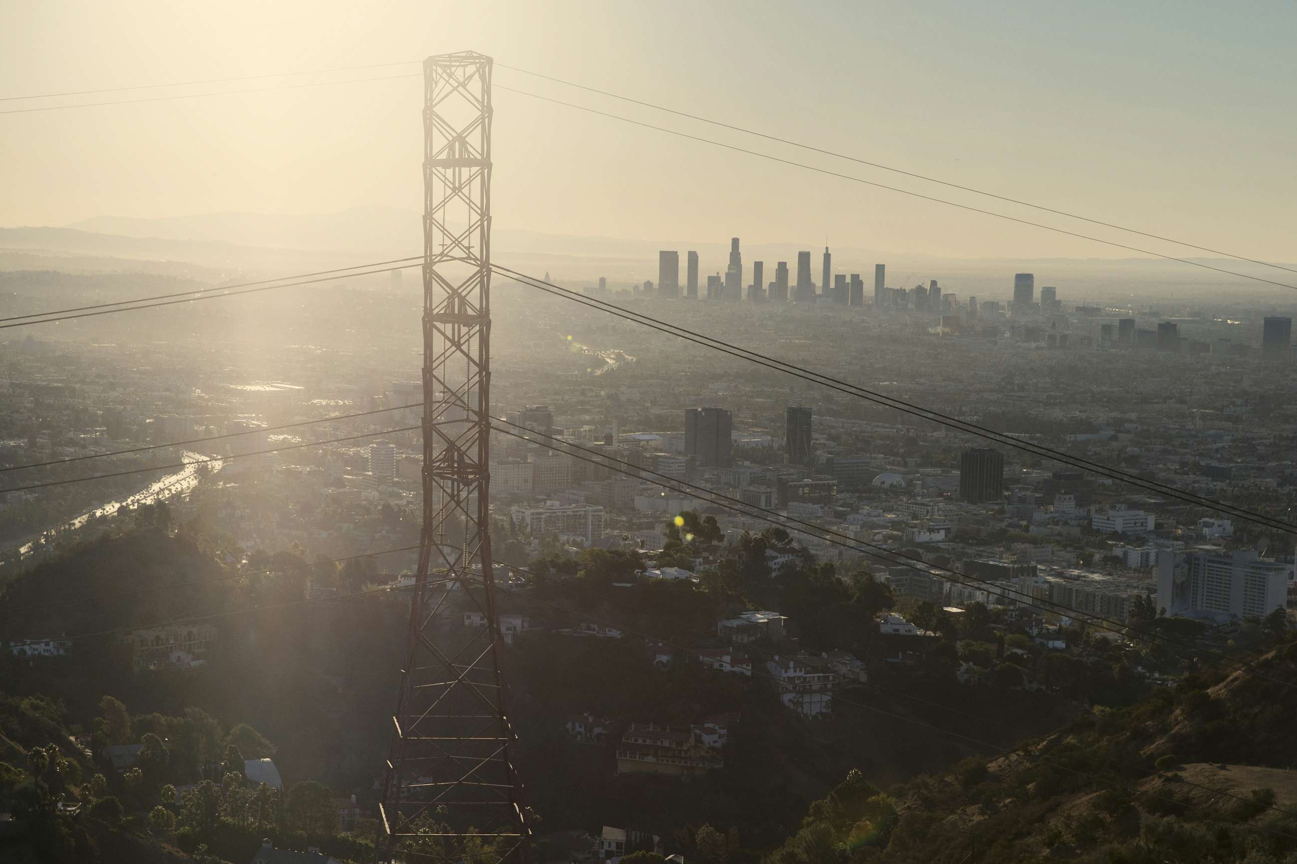
We wanted the LA stories and the user generated content to live side by side, much in the way you would expect to experience them in social media. So we took some cues from ‘Instagram stories’ with the navigation, to help tie them together. They help give the user an overview of the different stories/sections of the website, but they also function as loader and progress bar, throughout the experience.
The product, LA stories, and user-generated content is also connected through the use of typography on the landing page. And photography by Danish photographer Søren Solkjær, bring the stories to life in a beautiful way.
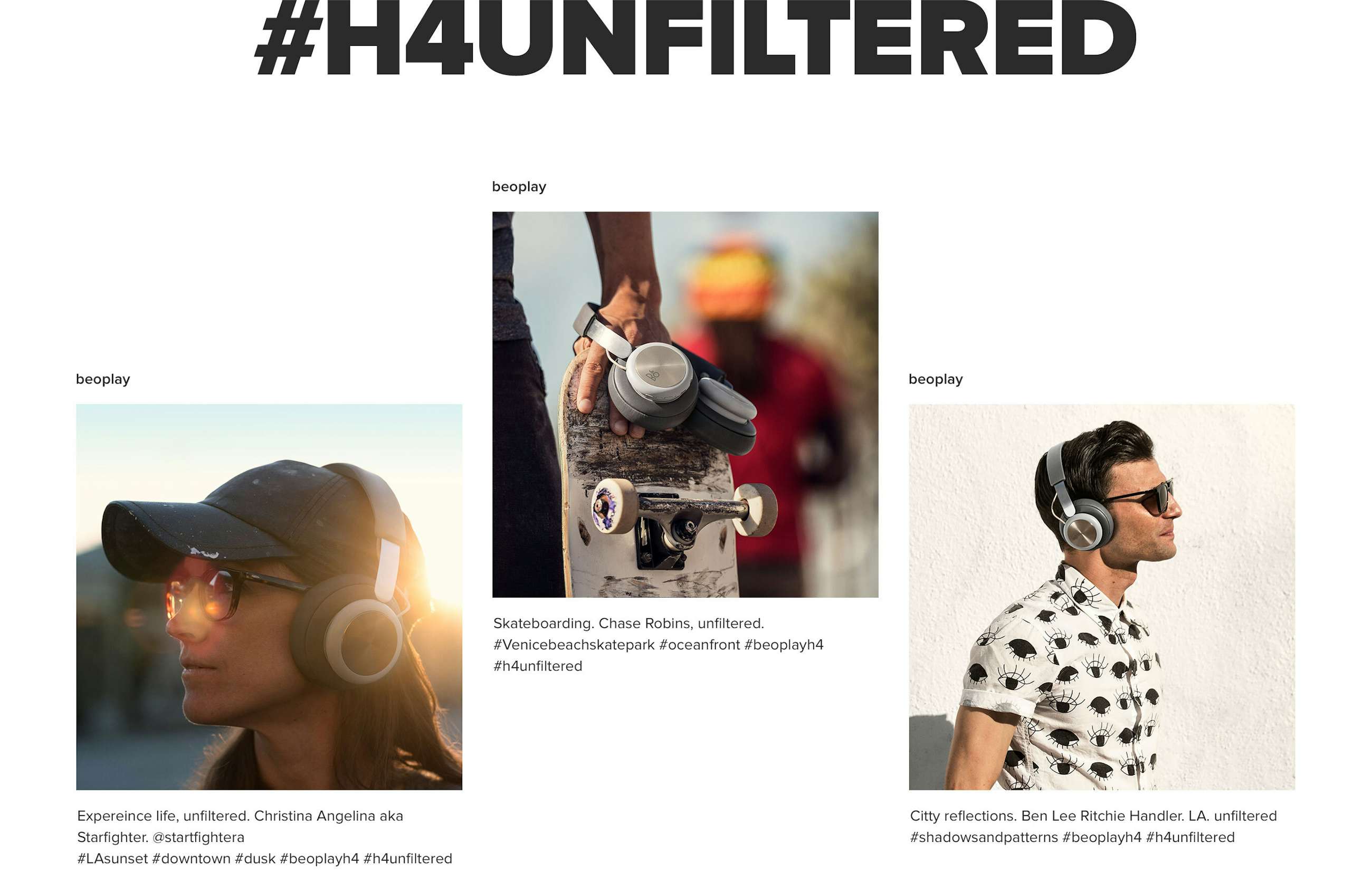
Phase two is a crowd sourced competition showcasing images from people using their new H4's. This section will be updated on a daily basis and a winner will be drawn each month.
Services
Launch of product page. Design, Motion Graphics & Development. Year 2017
Information
We helped Beoplay define the visual and navigational concepts. After having defined the overall concepts we went to sketch out the core user experience and started trying out different approaches to code the unique navigation. The production was less than two month, so very intense long days were not uncommon.
Awwwards
Site of the day
FWA
Site of the day
CSS Design Awards
Site of the day
Communication Arts
Webpick of the day
Awards
